Jan 26, 2023
by Chloe Gordon on 01/25/2023 | 3 Minute Read
When a brand is rooted in its name, and has been known for its packaging for over 20 years, a rebrand doesn’t happen lightly. Chicken of the Sea recently worked with Little Big Brands to design a new packaging system that reflects a more modern approach.
The refreshed mermaid character pairs beautifully with the splashy color palette and chunky, rounded, yet legible typeface. With a storybook-inspired illustration style, this brand allows canned tuna’s perception to feel more enchanted than one might’ve previously thought possible.
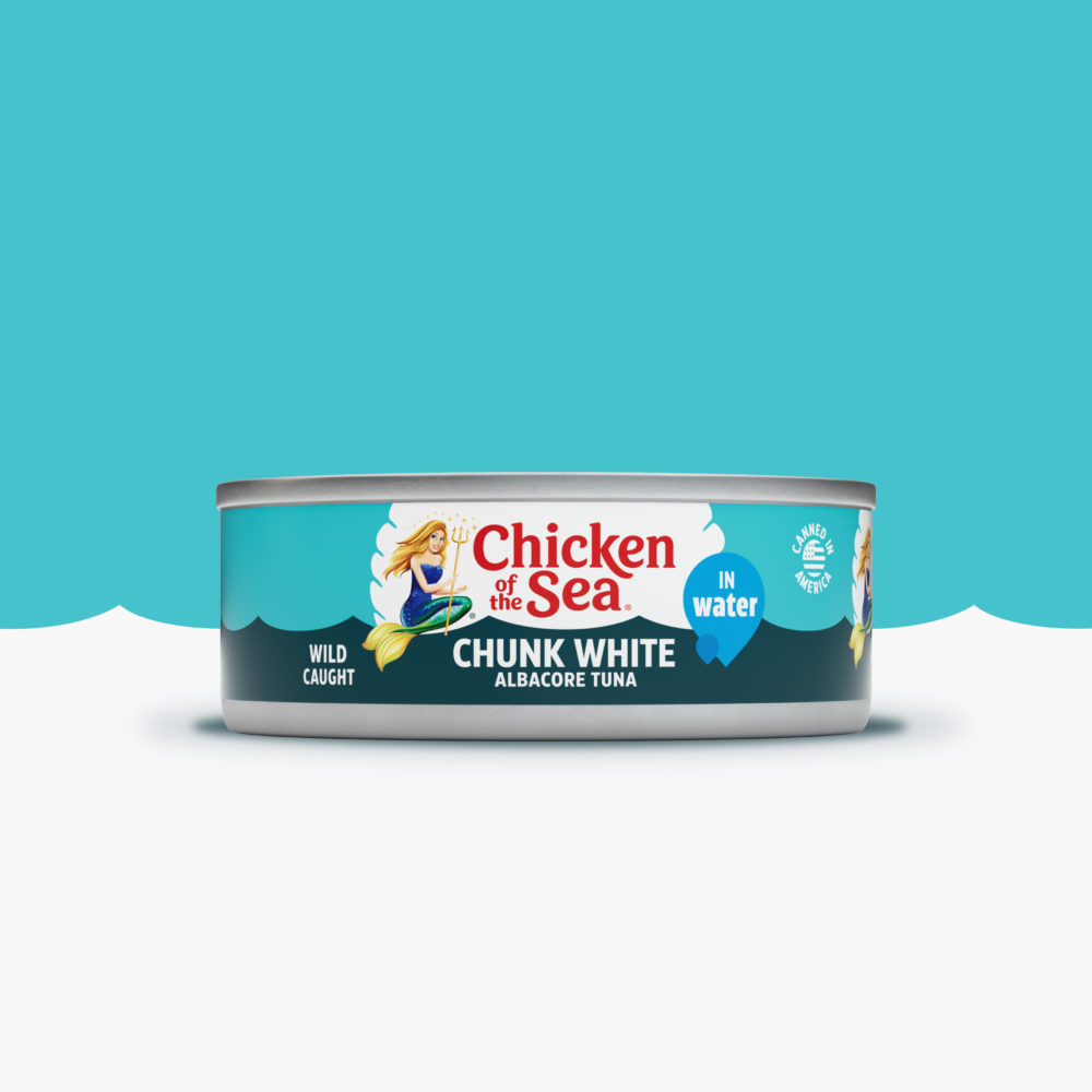
Chicken of the Sea is splashing into the new year with a modern look, including a fresh update for their iconic mermaid. This is the first complete rebrand for Chicken of the Sea in more than 20 years. The work was created in partnership with Little Big Brands, a New York-based branding agency, who led the strategy, design, and packaging work, as well as the creative launch campaign.
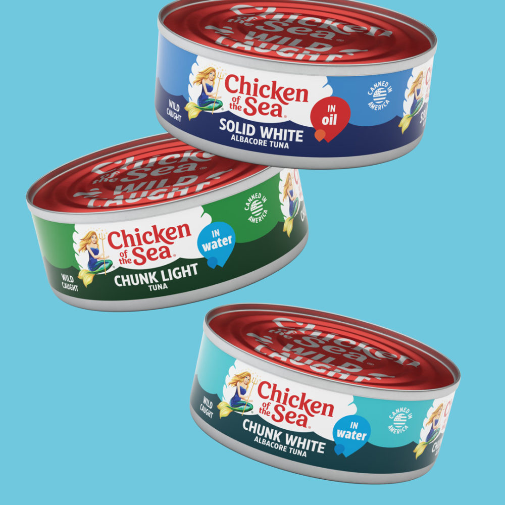
The brand strategy is grounded in Chicken of the Sea’s promise to consumers that they can eat healthy and live happy and infusing that ethos throughout every facet of the brand experience — from the updated packaging to the new website, to the launch campaign’s “Wild-Caught Happiness” tagline.
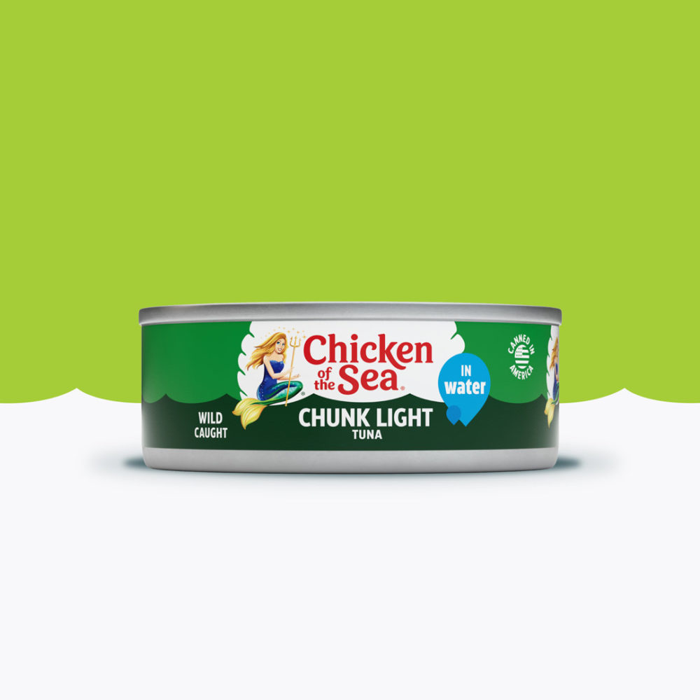
“We were committed to respectfully evolving Chicken of the Sea; retaining the historical significance while helping them gain modern relevance,” said John Nunziato, Chief Creative Officer, Little Big Brands. “One of the key pieces of this was helping Catalina, the mermaid brand character, embody a stronger more empowered female persona.”
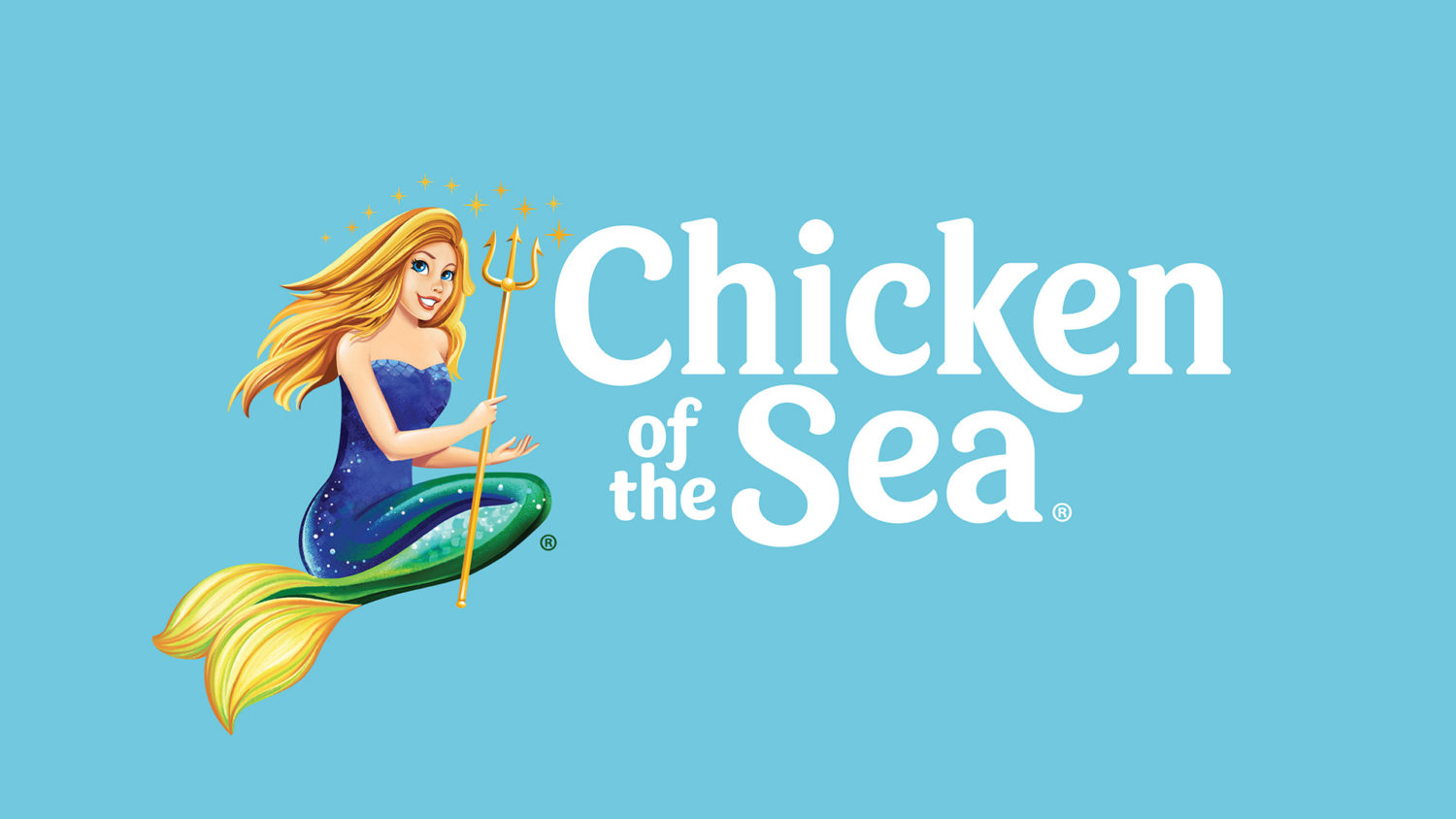
Today’s Catalina, like the brand, is a leader and a change agent for good which prompted the more modern illustration style. To help with brand visibility, Catalina was removed from the center of the logo, which serves multiple purposes. She can evolve as a standalone character, while allowing for a clean wordmark that can be stacked and scaled in size.
Instead of a gradient burst that can feel dated and is difficult to reproduce, the brand is now anchored in a white clamshell that creates a bullseye at shelf and is uniquely relevant to the sea. Communication was pared down to include brand, variant and key claims like ‘wild-caught’ to help consumers shop the shelf. Every aspect of the brand’s visual and verbal language was considered and updated across the portfolio in a thoughtful way to make the iconic brand fresh and vibrant.
“This is an exciting time for our iconic Chicken of the Sea brand. We were committed to evolving the brand in a way that was relevant and genuine, and were fortunate to find dedicated and inspired partners in Little Big Brands. Our collaboration has been a team effort like no other,” said Andy Mecs, Executive Vice President, Commercial, Chicken of the Sea International.
