Mar 16, 2023

The first major rebrand for the shelf-stable seafood company in 20 years includes a greater emphasis on its products’ wild-caught status and a makeover for iconic mermaid mascot and ‘change agent,’ Catalina.
By: Anne Marie Mohan

Iconic, shelf-stable seafood brand Chicken of the Sea has undergone a major rebranding undertaken to refresh and modernize the brand’s visual and verbal language, address inconsistencies in its product packaging, and reflect the company’s commitment to sustainable and responsible operations. The two-year project was done in partnership with packaging design firm Little Big Brands and was the first package redesign for the brand in more than 20 years.
Bill Frohlich, senior account director for Little Big Brands, explains why Chicken of the Sea had left its packaging graphics untouched for so long and what prompted the need for a change: “The shelf-stable seafood category as a whole has seen steady declines over the past 20 years, as younger consumers have gravitated to the perimeter of the store. But the sudden onset of the pandemic and some challenging economic conditions provided a resurgence for this pantry staple, with Chicken of the Sea seeing a boost in sales in 2020 as consumers sought out affordable, accessible, and healthy protein for their families. With lots of exciting innovations on the way, the timing was right for a rebrand.”
Shares Little Big Brands founder and Chief Creative Officer John Nunziato, throughout the project, the design team was committed to respectfully evolving Chicken of the Sea; retaining its historical significance while helping the brand gain modern relevance. “This is a heritage brand and wasn’t broken, so we took great care with the details,” he says. “We were very mindful of bringing consumers along and making sure they could continue to find their favorite products.”
To ensure the continuity of the brand while also bringing forth a new design bold enough to make an impact on-shelf and gain share against the company’s competitors, Little Big Brands spoke to every stakeholder, from the CEO on down, upon kicking off the project. “It was critical we had a clear understanding of their internal challenges, working hypotheses, and goals for this rebrand,” says Frohlich. “There are always going to be various opinions on how far to take the design, which is why it was so important we grounded all the work in the business and brand strategy.”
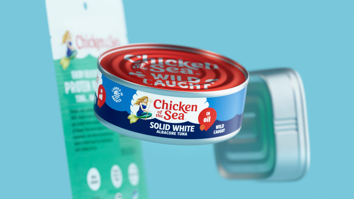
The new design focuses on several main elements: color, the presentation of the logo, the brand’s iconic mermaid mascot, Catalina, and Chicken of the Sea’s “wild-caught” credentials. Explains Nunziato, in regard to color, a huge part of the brand’s heritage is its palette. So, while Little Big Brands freshened up the colors, making them more vibrant and saturated, it continued to follow brand and category norms to aid in the shopping experience. “In fact, by bringing more vibrancy across the line, we made it even easier for consumers to shop by the colors they are used to looking for,” he says.


In addition, instead of the gradient burst used front and center on the existing design, which felt dated and was difficult to reproduce, Little Big Brands anchored the brand logo in a white clamshell that is uniquely relevant to the sea and creates a bullseye on-shelf. Communication was pared down to include brand variant and key product claims.
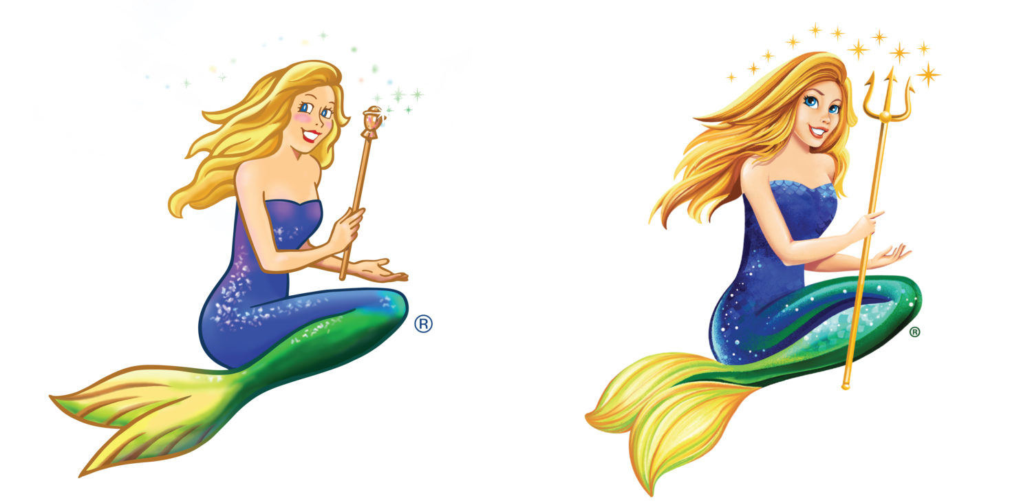
Catalina was likewise updated. “Today’s Catalina is a leader and a change agent for good, which prompted a more modern illustration style,” explains Nunziato. “Drawn to be more realistic, she has more dimension and a more confident stature, while wielding the power of her trident.” He adds that Catalina was also removed from the center of the logo, which gives her the opportunity to evolve as a standalone character, while also allowing for a clean wordmark that can be stacked and scaled in size.
A key differentiator for Chicken of the Sea’s products, which include shelf-stable tuna, salmon, sardines, and specialty products, is the company’s sustainable fishing practices and the high-quality of its seafood. As Nunziato explains, this is a huge part of Chicken of the Sea’s commitment to consumers. Through its SeaChange program, the company is working to address overfishing, leading the charge on safe and legal labor practices and overall responsible operations throughout the supply chain. To bring this message home to consumers, the can lid is colored a bold red and prominently features the copy, “Wild-Caught” in white, a designator that is also repeated on the label.
The new packaging design, which thus far encompasses 40 SKUs, launched in January 2023 and will continue rolling out through the year until the entire portfolio features the new branding. Frohlich also hints that there are many exciting new developments in the pipeline coming in the next few months.


