Jul 9, 2021
Reposted from Untapped for Business, by Grace Weitz
June 10, 2021
Brewing great beer is important but if you can’t represent the soul of your brewery through your branding, no one will understand who you are. With almost 9,000 breweries operating in the United States, your beer will only set you apart so much from the pack.
“How much better can your Hazy IPA be than the next guy?” says Ben Butler, co-founder of Necromancer Brewing and Top Hat, an award-winning design and marketing agency in Pittsburgh. “If two brands are sitting on a shelf right next to each other, you’re probably going to grab the one you’re more interested in. Branding now has the final say.”
For better or for worse, gone are the days of succeeding based on beer merit alone. Today, people want to hear the unique story that brought your company into the business. They want to connect with who you are as a brewery, learn about nuances that make you different, and understand your beliefs and values as a business.
But it can be challenging to answer the questions: Who are you? Who is your brand? And how can you visually represent your brewery in a few short words, colors, and illustrations?
We asked the experts at some of the top beer-focused design agencies around the country to share how they attempt to answer these questions, how to design a brewery logo and what makes the best ones work. This article covers the following topics:
- What Is A Brewery Logo?
- How To Define Your Brewery Brand
- How to Choose A Brewery Logo — Don’t Cut Corners
- The Four Elements of a Brewery Logo
- How To Test Your Brewery Logo
- Avoid These Design Dangers
- Some of Our Favorite Brewery Logos and Labels
What Is A Brewery Logo?
A logo is the emblem that your company designs to visually represent your brand. Although it can be small, a logo has the potential to have a huge impact. Oftentimes, a logo will be the first glimpse consumers have into your company. So it’s absolutely worth your time and investment to create a symbol that reflects your business’ character and identity.
“One of the first things I say to someone is, ‘Think about what you mean when you say logo,’” says Matt Tanaka, founder and Creative Director at Stout Collective, a brand strategy and design studio for the beer industry. “Are you looking for a brand marker? A specific icon? A visual identity? A logo is not one little thing; it’s a small part of the bigger piece.”
That larger picture alludes to who you are as a brewery and a brand.
“If you think about who you are as people… and what you’re all about, and then look at your existing logo, does it match?” asks Tanaka. “Does your design communicate things about you that make you who you are?”
If the answer is no (or you haven’t even answered these questions to begin with), then you’ve reached your first step.
How To Define Your Brewery Brand
To develop a good logo, you first need to spend time thinking about what you want to communicate as a brand.
What does your company represent? Who are you? What is your story? Are you loud, fun, and bright? Or are you a bit more serious, thoughtful, and traditional?
“If you’re a really goofy, fun, playful brewery with wild styles and fruited sours, your logo should convey that,” says Tanaka. “But if you’re an uber-traditional lager house that only brews Reinheitsgebot, you have to communicate that personality in a logo.”
It can be incredibly challenging, but assessing these questions is crucial. The answers will guide your logo design (and consequently your whole business approach) in the long run.
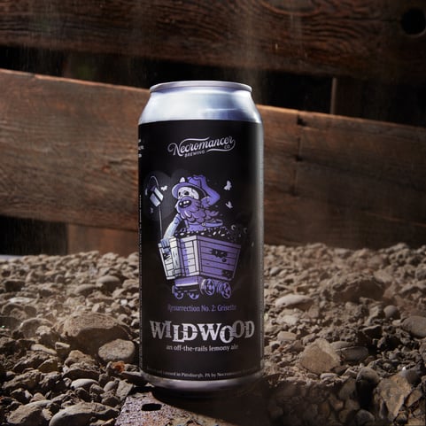
To start, Butler suggests making what he calls a “bank of brand adjectives.” Go ahead and write eight to twelve words that describe your brewery. For example, when starting Necromancer, Butler jotted down adjectives like “mystical” and “elegant.” Those words have helped drive decisions he’s made throughout the brewery, including with the logo.
“You have to do your homework,” says John Nunziato, founding partner and Chief Creative Director at Little Big Brands (LBB), a branding agency about to celebrate its 20th anniversary. LBB has worked with clients of all sizes from The Lion Brewery to Weathered Souls and prides itself on being a “family-first agency that doesn’t work with a-holes.”
“Your brand mark should represent the values of your brand,” says Nunziato. “You should look at a mark and feel, taste, and experience what your [brewery] is like… even when people aren’t in your environment.”
Butler continues, “You have to do that groundwork. You need to make those decisions. No one can tell you what your experience should feel like. That comes within. And it’s important to cast that vision.”
Answering these questions will set the parameters for defining the actual visual aesthetic.
More Than Meets The Eye
Once you’ve determined who you are as a brand, it’s time to figure out your style as a brand.
Tanaka says he’ll often send clients out on an exercise to go into the world and pull references from other logos, fine art, or even just a record sleeve that they feel fits their company’s vibe.
Similarly, Nunziato says LBB will actually do an audit of up to 200 brands. They’ll start by pulling logo marks, photography, illustrations, and styles they think a client will like. Then they’ll get everything up on a wall or compose it into a snapshot to review.
“It’s like picking through your closet,” says Nunziato. “What are some things that are turning you on or you have always admired?”
Once you have the bigger picture and know what you like, how do you actually design a logo?
The short answer: You don’t.
How to Choose A Brewery Logo — Don’t Cut Corners
When choosing a logo, the most important thing you can do is choose the right partner.
Butler puts it very concisely: “You should hire a designer, period.”
When you’re starting a brewery, would you brew the beer if you didn’t know how to develop a recipe? No — you’d hire a head brewer. The same applies to design.
“It’s like music,” says Butler. “Not everyone can sing and that’s a fact of life. Probably the most important consideration [in designing a logo] is finding the right design talent.”
Now, that could mean many things. Your designer could be someone already on your full-time staff, like a graphic illustrator, or you could hire a freelancer or an agency.
Find the Right Designer for Your Brewery Logo
The best way to go about finding an external designer will be to evaluate their previous work. Check out their current portfolios and see if that work resonates with you.
Chances are, if you aren’t interested in a certain designer or agency’s style from the get-go you won’t be happy with the design they create for you. Take the time to find a partner to work with that you believe in, and who believes in you.
“You want to like their work because they are going to help you build this thing that will have a huge impact on your business and brand,” says Tanaka. “It is not the time to cut corners. Find someone you trust and open up to them.”
So can set up a time to speak with a potential designer and have a conversation.
“One of our company values is that everyone deserves a chance and a conversation,” says Tanaka. “Anytime someone reaches out to us, we set up a call to have a chat just to see if it is a good fit.”
If the fit is right, the logo design will flow.
The Four Elements of a Brewery Logo
Now that you’ve answered the existential questions, determined the visual emblems you feel fit your company’s vibe, and found the right partner for the job, it’s time for the fun part: designing your brewery logo.
Even though you’re probably not drawing the logo yourself, you can still offer input. So it’s helpful to, you need to understand how logo design works.
Tanaka likes to break down the elements of a great logo into four categories. The tricky part of logo design is finding a way for them to interact harmoniously.
#1. Illustration or Iconography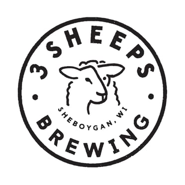
What symbols or designs represent your brewery? When working with 3 Sheeps Brewing Co. on a logo redesign, Tanaka discovered that the brewery described themselves as “doing everything with a wink, humor that is a little cheeky but never rude.” As a result, the new logo Tanaka designed included two sheep: one on its side profile and the other looking at the viewer. Together, they combined to form the outline of a third sheep (get it?).
Think about what symbol represents your brewery. It can be a unique ingredient, an icon of the city where you operate, or even something meaningful to you. Just make sure it stands out.
#2. Typography
Sometimes, a picture is worth a thousand words. Other times, a couple of words are a picture.
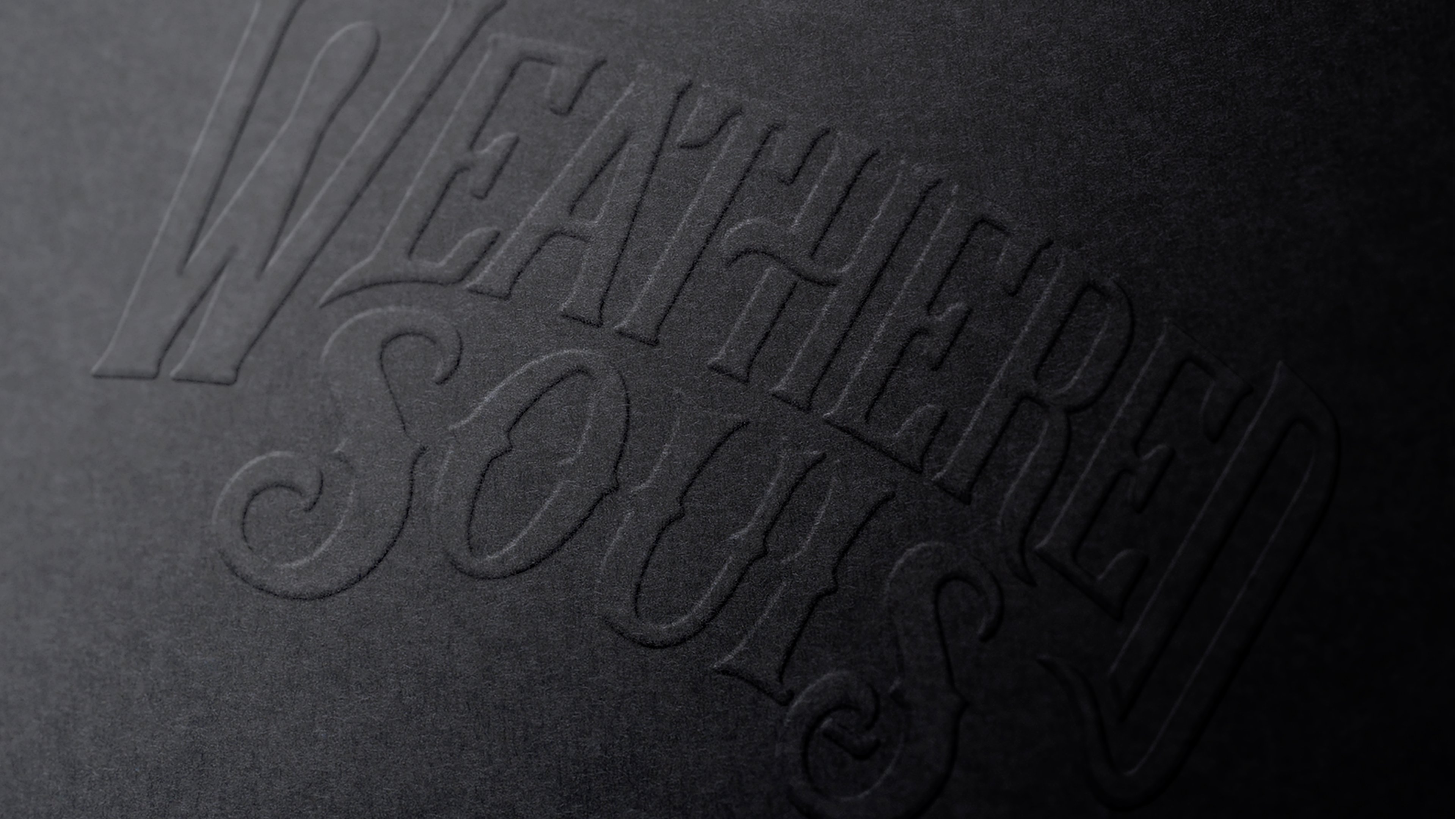
“Typography is king,” says Nunziato. “Your typography and architecture have so much nuance that building type and letterforms becomes an ownable mark for you.”
Little Big Brands actually hand draws all of its fonts, meaning each client’s typeface is unique to that brand.
#3. Color
What is your color palette? Are you big and bold or simple and soft? Again, if you’ve answered those questions above, your colors will logically follow. But, here’s where a designer’s expertise will really come in handy, too.
#4. Layout
The most traditional beer logos fall into a circular or oval shape but there are many different layout options you can explore. People like circular or tombstone shaped lock ups because they feel timeless. On the other hand, Tanaka points out that today’s trending logo designs often include a stacked format, where you stack an icon on top of typography or vice versa. Other types of current designs include minimalist, ingredient-driven, and retro.
How To Test Your Brewery Logo
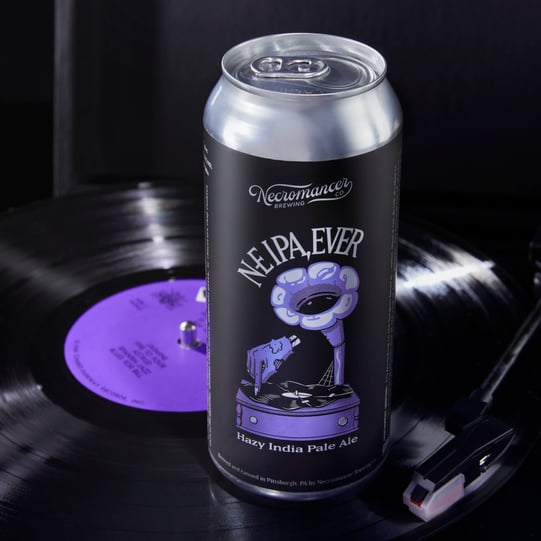
It’s important to remember that your logo will live in a large number of different applications. Whether added to a festival poster, plastered outside your taproom, included in a giant mural, or on a tiny corner of your beer label, your logo will work its way into an invariable number of situations. In all these applications, a consumer needs to immediately recognize your logo and tie it to your brewery.
As an insider tip, Nunziato says that pretty early on, you should print out your label and put it on a bottle or can. Go sneak into a store and set it on the shelf to get a good look at it — because renderings can only go so far. Seeing your logo on a shelf lets you ask yourself, Would I pick that up? Why would I pick it up? What makes it look and feel different?
“Mocking up a logo out of your own printer and getting a look at it will propel you way past a lot of other brands,” says Nunziato.
Avoid These Design Dangers
Over-complicating
“Your logo can’t do everything,” says Butler. “It has to be like shorthand or something memorable that sets the tone for the rest of your design aesthetics.”
Butler notes that if you think of some of the biggest brands out there, like Nike and Mastercard, their logos are often the simplest. Nike is just a swoosh while Mastercard’s logo features a couple of circles.
Nunziato cites Monster Energy, whose simple mark includes a three clawed monster ripping through the logo to cleverly create an “M.”
“I wish I had thought of that,” says Nunziato. “It’s just a good, simple mark that’s everywhere now and hugely successful.”
Nunziato says that while it’s trendy to use colorful illustrations, these designs can actually complicate your storytelling and dilute a brand’s story.
Your logo can only do so much. It’s the first glimpse into your brand. So, it doesn’t have to tell the whole story. You’ll need to fill in the rest of the details of your brand through your website, sales materials, packaging, taproom layout, and more.
Over Simplifying
Conversely, Butler points out that a lot of labels these days seem to be missing character.
“It looks like people downloaded a craft brewery logo template and plugged in their name,” says Butler. “The personality and character are missing… not as many people are leaning into things that are more risky, whimsical, or disruptive.”
Butler wants to encourage breweries to take risks. Instead of pigeonholing yourself into what you think people want, push yourself to be who you are. it all goes back to the very beginning: determining exactly who you are as a brand.
Copycatting
Be yourself. Butler says a big pitfall he’ll run into are brands wanting to be like Sierra Nevada or Stone.
“Start with, “Who am I?” rather than what looks cool,” says Butler. It’s important here to make a distinction between impersonation and inspiration. Using logos and artwork you see out in the wild to inspire you is an important exercise for designing a good logo. Selecting a “look” without first doing the homework to define who you are as a brand will be a shortcut that can cause problems down the line.
Interested in finding some inspiration for your logo? Check out Hop Culture’s picks for the top beer label designs of 2020.
Some of Our Favorite Brewery Logos and Labels
We asked Tanaka, Butler, and Nunziato to share a few of their favorite labels they’ve worked on and what made them work so well.
Sideward Brewing – Stout Collective
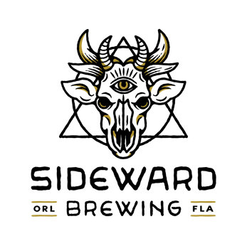
“The process for that one was really involved. We went down a whole bunch of different routes and ended up with the phrase: “creepy cute.” We were really inspired by motorcycle culture and metal records, but also the people behind the brewery who are really fun. [The brewery] has this open, welcoming vibe and community space… so the logo wasn’t something like a traditional big market product that we’d call scalable, but it really reflected the personality [of the brewery] and as a result caught on pretty well.”
Weathered Souls – Little Big Brands
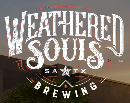
“With Weathered Souls, a lot of meticulous love and handcrafted nature goes into the different craft brews they create. We wanted a typography to reflect that. Likewise, we used their cheeky skeleton characters to poke a little fun.”
Iron City – Top Hat
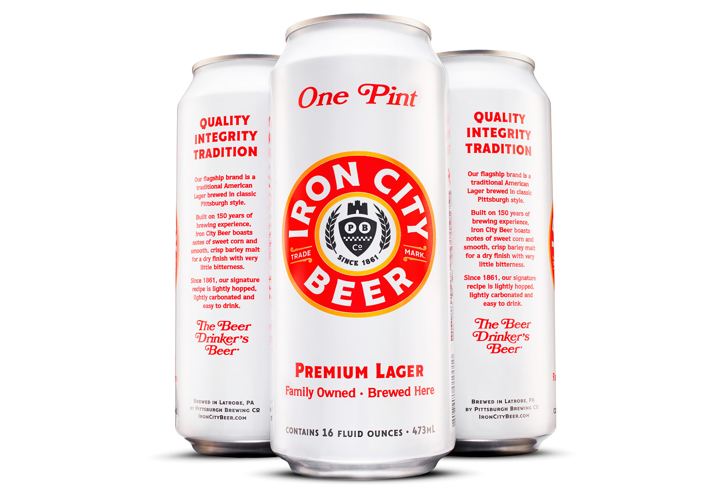
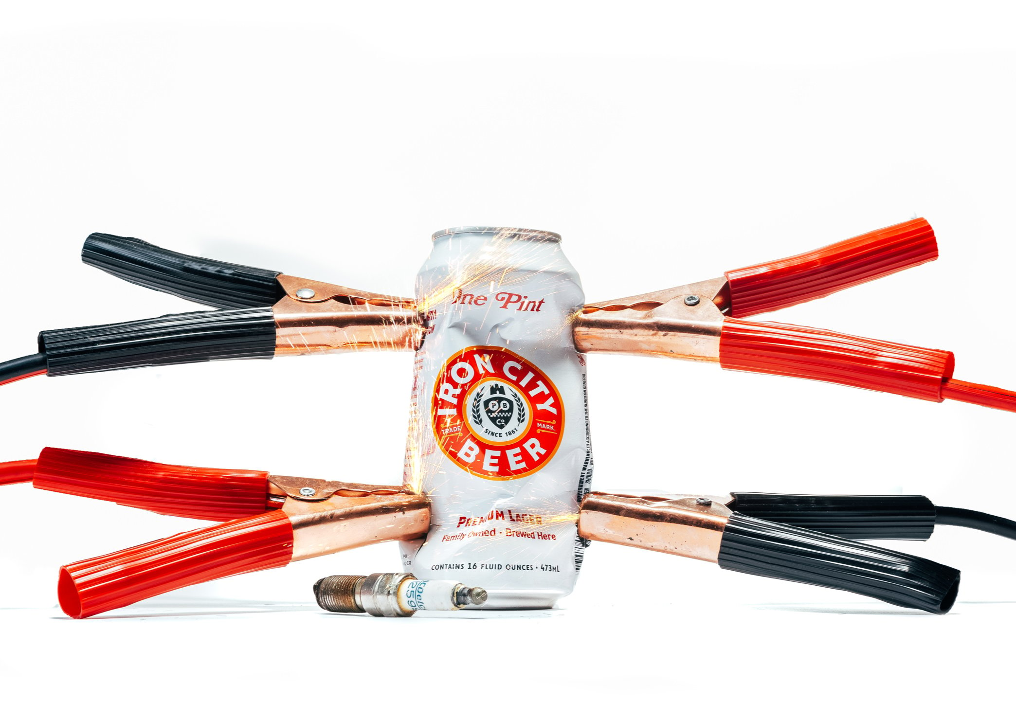
“Our work for Iron City and IC Light are pretty iconic pieces that showcase the shorthand that’s memorable, but can be built with context around it. This branding was like a second wind for Pittsburgh Brewing Co. here in Pittsburgh. They were on the downturn, people didn’t believe in it. We rooted their branding in a fresh identity that helped to convince people over time that something had changed.”
Reuben’s Brews – Top Hat
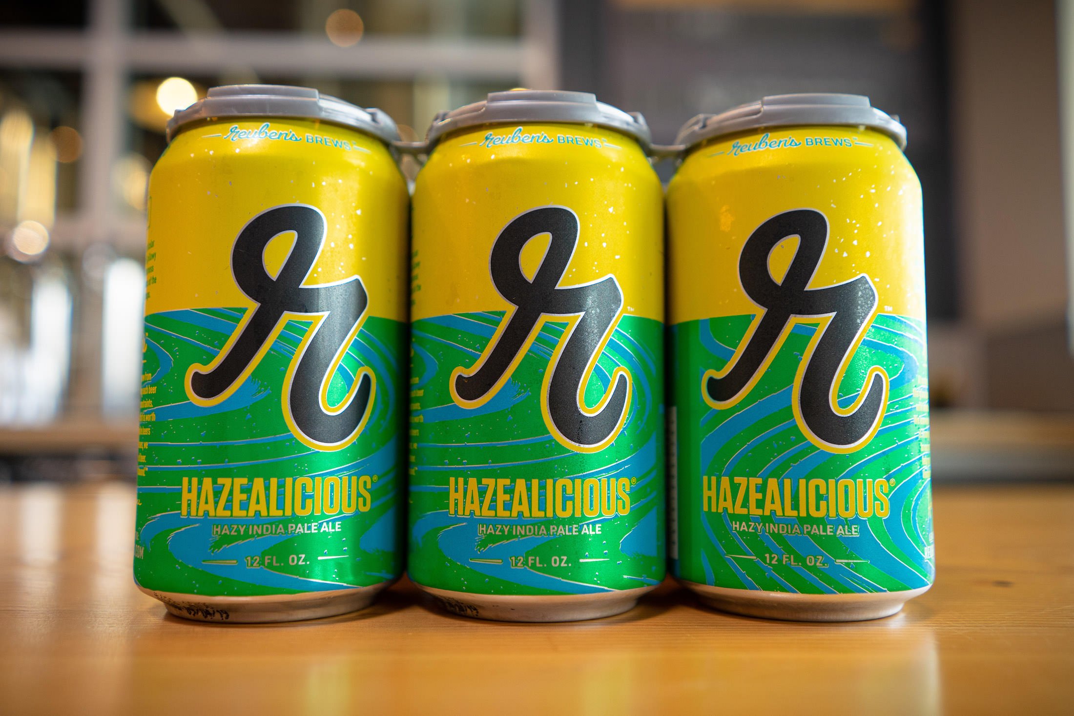
“Reuben’s Brews is pretty iconic in Seattle. It was just a matter of putting a lot into something more simple like the big “R” that leads [the logo].”
A Final Word on Brewery Branding and Logos
We know that designing a logo can be difficult. There are a hundred questions to answer and a million little details to consider. However, creating a coherent and creative way to define your brand is absolutely essential in today’s craft beer industry.
“We get it,” says Tanaka. “This can be confusing. It can be hard. This is scary and expensive and it takes a ton of time and effort. But, it’s incredibly important. I can’t overstate the importance of the time and the investment.”
Nunziato frames it this way: “It’s a beast to start something from scratch… but you can have the best product with a horrible logo and no one ever finds out about it, or you can have the worst product with an incredible logo and convince people that it’s an incredible product.”
Don’t get lost in the crowd. Your logo is critical to your brand, taking the time to get it right is an important step in positioning your brewery for success.
Source: https://lounge.untappd.com/how-to-design-a-brewery-logo

