Little Spoon
With a ton of new innovation in the pipeline, there was a real opportunity to create a more unified, modern visual palette for Little Spoon.
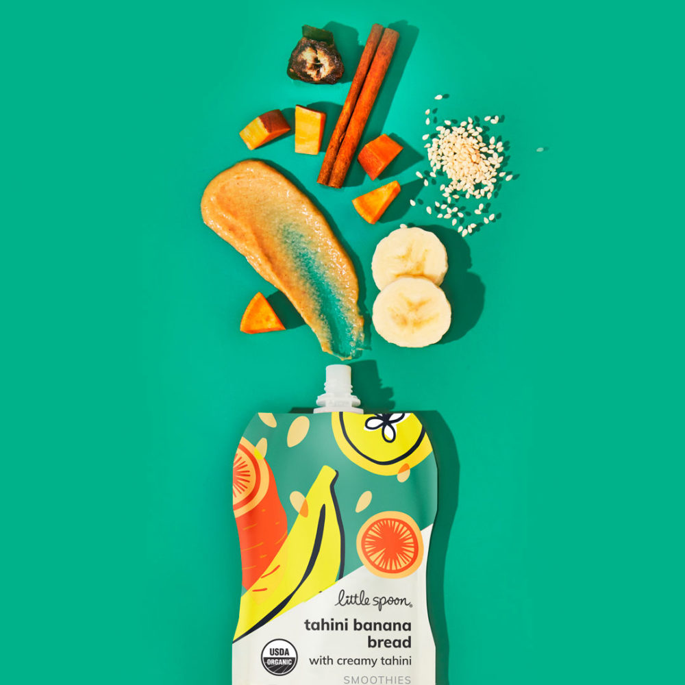
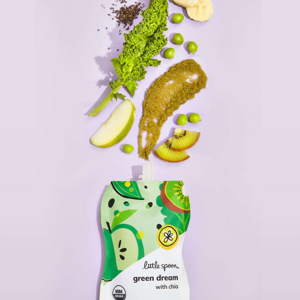
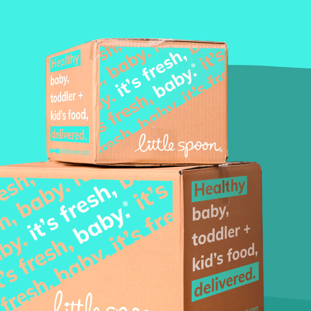
As a brand that is focused on Millennial parents, compelling aesthetics are table stakes. At the heart of this redesign was bringing visual cohesion to the portfolio. Unique and ownable illustrations were critical, as was a fresh and vibrant new color palette. The result is a brand that follows modern DTC codes, while remaining true to its DNA.
Along with the new branding comes a much-anticipated website upgrade with an optimized menu experience, as well as product deep dives highlighting key ingredients and unique hidden veggies and superfoods.
