May 16, 2022
Organic baby foods company Little Spoon redesigns its packaging for a more cohesive, impactful look across its range of products and to work better in the D2C environment.
Since launching its Babyblends refrigerated organic purées for babies in 2017, Little Spoon Organic, LLC has expanded its product line to include toddler and kids meals, vitamin boosters and remedies, and most recently smoothies. From the outset, Little Spoon’s packaging—a cup with attached blue spoon, decorated with minimalist, modern graphics—has reflected the brand’s strategy, which is to provide “high-quality, easy-to-use, and reasonably priced solutions that make it easy for parents to keep their kids healthy.”
In early 2021, as the San Francisco-based company got ready to roll out a new line of preservative-free, cold-pressed smoothies, it used the occasion to refresh the packaging for all its products, with assistance from its agency of record, Little Big Brands (LBB). “Critical to the rebrand was reflecting our fresh take in a space that has remained largely unchanged, despite all the ways parents—their standards and their lifestyles—have evolved,” explains Little Spoon VP of Brand Marketing & Partnerships Caryn Wasser. “We got started to truly do things differently, and we wanted to communicate that approach in our brand ID.”
According to LBB partner Pamela Long, despite Little Spoon’s staggered introduction of new products, the brand always maintained a cohesive look, but the development of the smoothie line provided a clear opportunity for the brand to be more overt in its design. “As they were spearheading a new wave of innovation, it was the perfect time to reconsider the brand as a whole and elevate that connective tissue,” she says.
LBB gathered insights for the redesign using online research tools to get quick feedback and align on design. “Thankfully, many of the folks on the client side and agency side are Little Spoon consumers,” Long says. “So we love and live this brand ourselves and see firsthand what is working and what isn’t—from the ordering protocol, to the unboxing, to the feeding experience. There is also a growing, robust online community of Little Spoon parents that we tap into regularly; their feedback and experience shapes everything we do.”
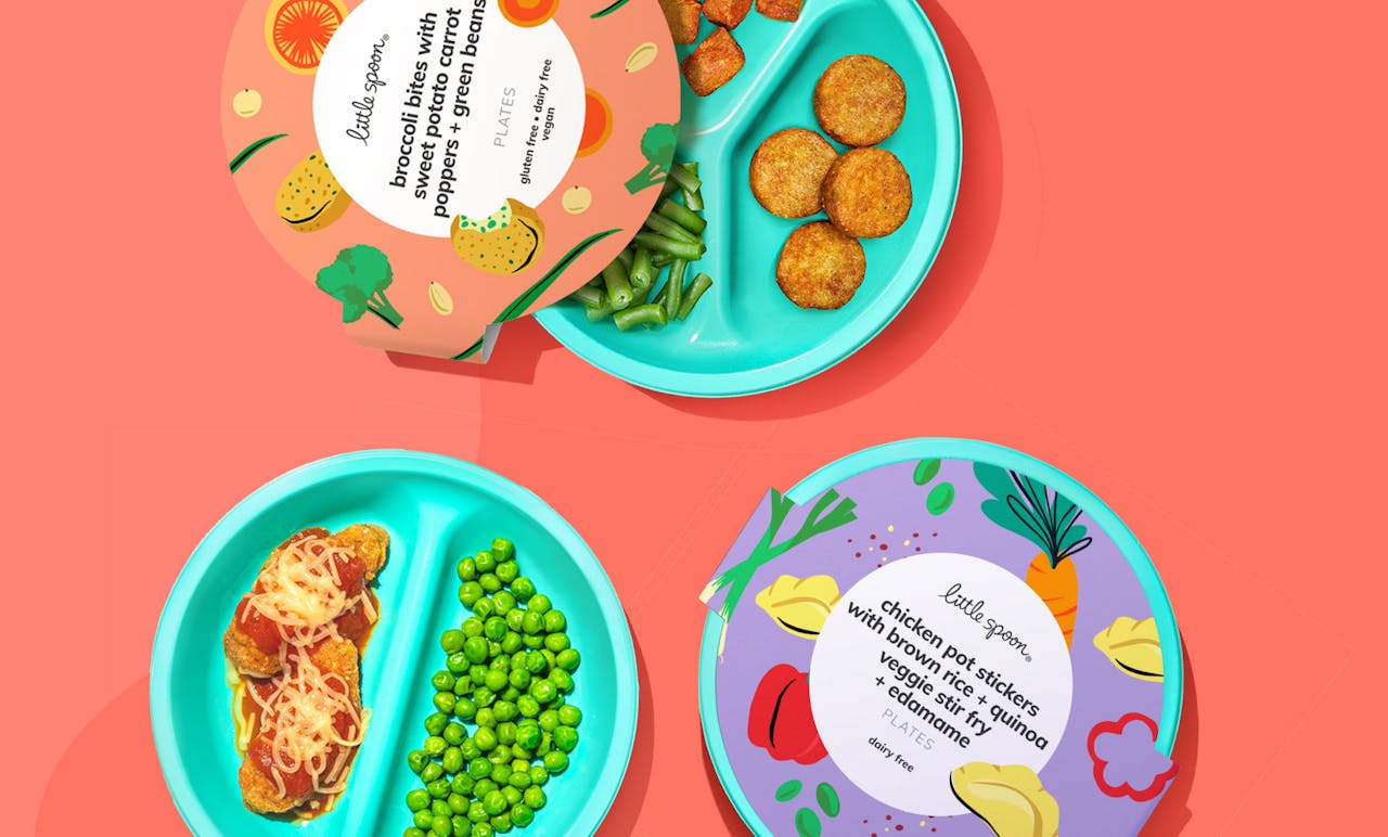 Little Spoon’s Plates line of nutrient-dense, clean-ingredient meals come in 29 options, made for early finger foods through big kid years, in vacuum-packed packaging.
When rebranding Little Spoon, LBB needed to consider modern D2C design codes. “Generally speaking, designing for D2C is different than a brand that will live and compete at shelf,” explains Long. “With D2C there just aren’t as many rules. You don’t have to worry about as many competitive nuances, and there is a lot less copy and regulations for on-pack, which frees up the design and allows for more creativity. There is also more opportunity to create a cohesive brand as you don’t have the same issues with differentiating SKUs at a retail level. Lighting, shelf placement, brand blocking—none of those things apply.
“D2C brands are digitally native and lend themselves to storytelling—that includes the design and elements used in the branding. They tend to look and feel modern, clean, and iconic. The branding is typically hyper-consistent, and copy is minimal. All of these principles were incorporated into the updated Little Spoon brand, while never losing sight that it is a product that needs to appeal to parents and kids, and celebrates the vibrant, fresh foods and ingredients the brand is known for.”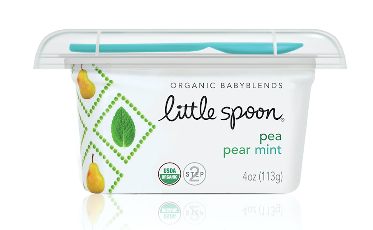 Little Spoon Babyblends purées BEFORE the redesign
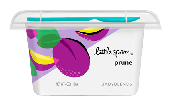
Little Spoon Babyblends purées AFTER the redesign
According to Long, a successful redesign is a balance of retaining elements that are still working hard and evolving or introducing new designs or graphics that elevate the brand. For Little Spoon, LBB kept the brand’s hand-drawn logo as well as its turquoise brand color throughout the structural elements. However, in contrast to the previous packaging, which featured dainty ingredient icons arranged in geometric patterns against a white background, the new branding has a stronger, more concentrated and vibrant color palette, in addition to white. Communication is clean and easy to navigate, with the ingredients always being hero. The food imagery is still playful, but now custom-illustrated to be bold and graphic, rather than using intricate patterns.
“Finding an ownable illustration style was really key to the work,” says Long. “It needed to feel fresh and unique and be a style that we could see relating to both parents and kids. It couldn’t be too perfect or precious. With a ton of SKUs and ingredients that needed to be illustrated, it also had to have extendability.”
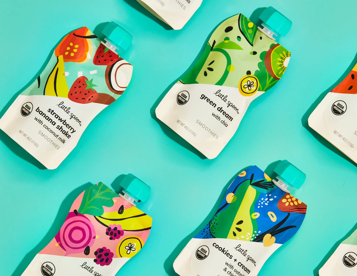 Little Spoon’s new organic, cold-pressed smoothies come in flexible pouch packaging, for on-the-go consumption.
Little Spoon’s product lines include its High Pressure-Processed Babyblends purées, in 38 varieties covering four stages, from Starting Solids to Transition Meals; Plates nutrient-dense, clean-ingredient meals in 29 options, made for early finger foods through big kid years, in vacuum-packed packaging; three varieties of Boosters all-natural, powdered natural remedies and vitamins—Poopie Power, Sniffle Shield, and Wiz Kid—in stick packs and a wallet-style carton; and eight organic, cold-pressed smoothie flavors, in flexible pouch packaging, for on-the-go consumption. The products are available online through Little Spoon’s website as a single purchase or on a subscription basis.
From Packaging World
